Not on the High Street
Create the design system & documentation for the website including check-out screens
Information:
Sector: e-commerce
Role: UI / Design System Specialist
Team: Lead Director, 2xPD
Contribution: Design System
Year: 2021
Overview:
When I joined Not on the High Street, they were without a design system and undergoing a rebranding. As a result, it was essential to develop all the necessary components and documentation to facilitate the creation and implementation of the new design. During my tenure at NOTHS, I played a key role in establishing the design system, creating documentation, and was also involved in enhancing the new check-out flow.
The Challenge
Create the design system and style guide entirely from scratch by meticulously establishing all the essential components using Sketch for the design team. Work in close collaboration with the Design Director to accurately define each component, ensuring thorough documentation is provided for the engineering team to streamline implementation in subsequent stages.
Main Goals
Develop a system with the capacity to grow effectively.
Create components and documentation following the style guide.
Assist the team in developing the check-out flow.
Share the progress with the leaders on a regular basis.
Definition Phase
Having a solid design system is crucial for NOTHS to ensures consistency across platforms, improving user experience by providing familiar interfaces and interactions. It streamlines the development process, enabling faster, more efficient design and coding, while reducing redundancy and ensuring alignment across teams.
User Needs & Business Goals
We would test the components to ensure the design system will effectively address real user problems and and support the company’s strategic goals.
Audit Existing Assets
We recently completed a comprehensive audit of the current design and code assets, enabling us to pinpoint any inconsistencies, highlight reusable patterns, and uncover potential gaps in our existing systems.
Design Principles
We meticulously analyzed the research and audit findings to establish a comprehensive set of guiding principles that serve as the foundation for our endeavors.
Planning Execution
I had to organize the necessary components and compile a comprehensive list to gauge the scope of the task. With the list in hand, a systematic process was developed to facilitate smooth progression through testing and approval.

List of items to make.Colours
These screens showcase a range of colors designed for the website and its variations. Deliberately, only lighter and darker versions have been included for each color, ensuring a coherent and harmonious palette throughout.

Typography
For the typography design, I meticulously crafted various typeface variations and established clear guidelines for their effective utilization.

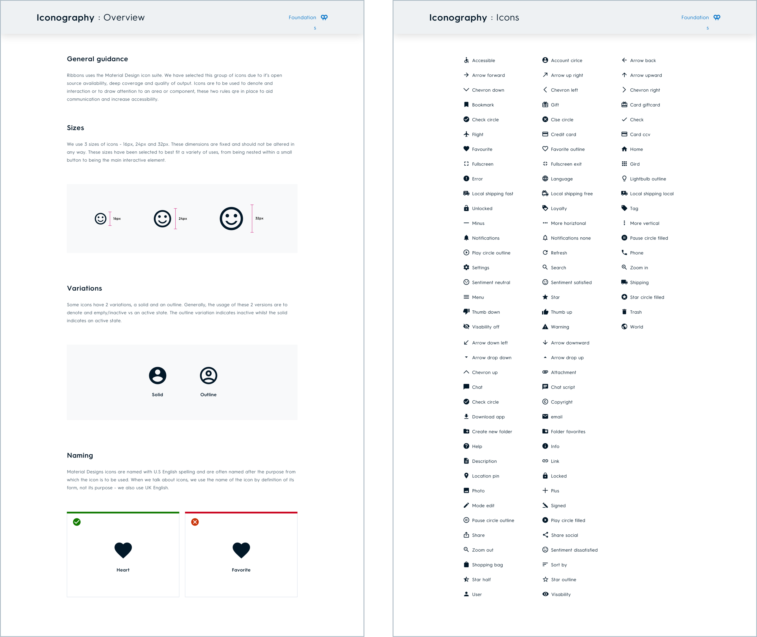
Iconography
These screens effectively portray the iconography through a cohesive application of general usage guidelines.
Grids
Grid rules have been meticulously crafted to ensure optimal display on various devices, catering to desktops, tablets, and mobile phones for the responsive website design.

Dividers & Elevation
Dividers and elevation play a crucial role in product design, as they help establish a uniform visual presence and enhance product consistency. By clearly defining these elements, designers can ensure a cohesive and polished look that resonates with users.

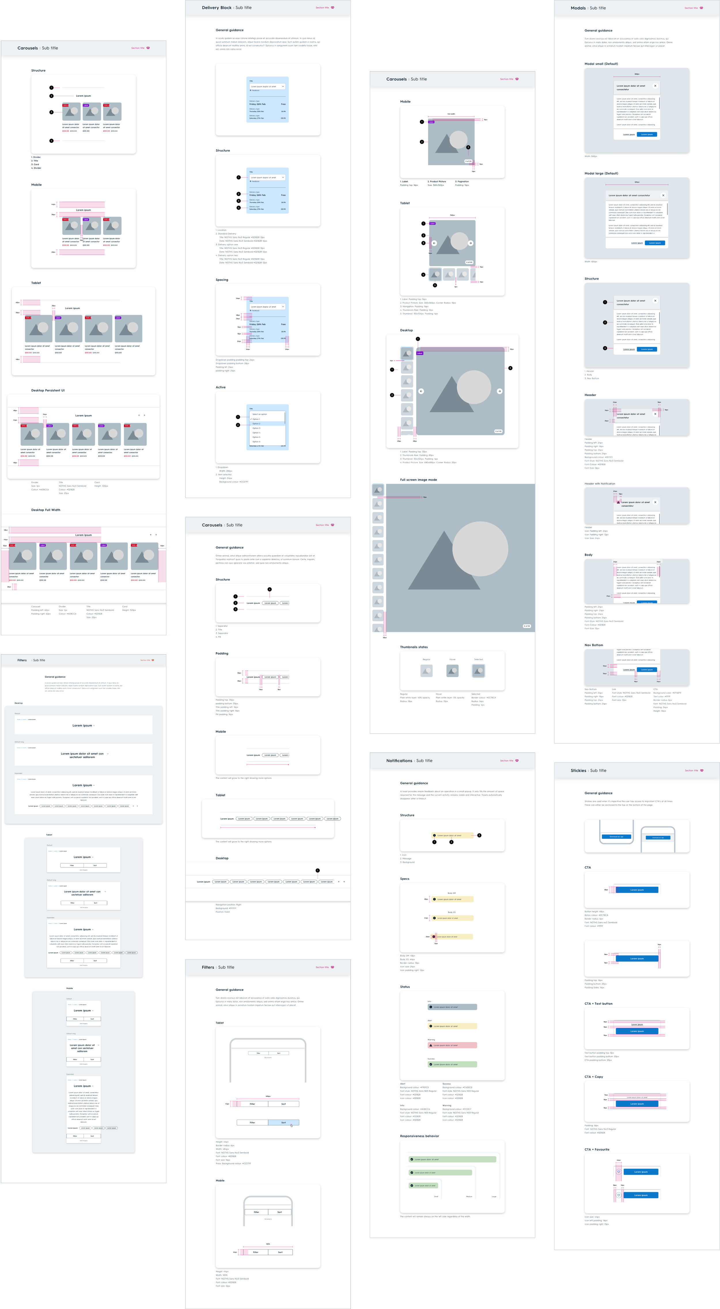
Components
The screens below display the comprehensive documentation for the component I developed within the design system. Each element is meticulously outlined, providing developers and designers with clear guidance on the correct implementation methods.
Check-out
During the check-out phase, I meticulously crafted the screens using the latest final components in collaboration with user researchers and fellow designers. Our collective efforts were instrumental in bringing these designs to life and ensuring a seamless user experience.

Confirmation Screen
The refers to the final screen displayed at the end of the checkout process, showcasing the newly added components ready for purchase.

Key Components
These are some of the final UI components being meticulously refined for the checkout process, ensuring a seamless user experience from start to finish.

Outcomes
The work I did for NOTHS laid the groundwork for the current design system in place. The components are highly scalable, ensuring seamless integration with the style guide and other elements. This streamlined approach proved invaluable during a recent rebranding effort. Simply by updating the colors, all components were automatically refreshed and remained fully operational.